


I’ve lived in four places post leaving my childhood home: The first was a small ground unit which I rented whilst completing my Master’s degree. The second, and most well known to many, was my Bryanston loft which I owned and lovingly lived in for 11 years. The third was a duplex rental of 18 months as a transitional place whilst searching for our family home. And finally, we now have our 120-year-old heritage home. The common theme in each of these? I have never gotten round to really decorating my bedroom!
With every home I lived in, I have always primarily placed emphasis on and exhausted all my creative flair on the dining areas and kitchen, neglecting the room that I’m meant to decompress in and lay my head to bed at night. In the loft, I lazily painted it Millennial grey, got white duvet linen and slapped on a yellow throw and scatter cushion - defaulting to the safety of those corresponding colours as a means of obtaining some form of completion.
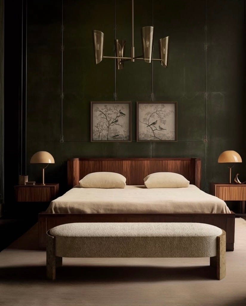
When we viewed and purchased our home, we had grand (and immediate) ideas of how we would design almost every room - midnight ink for our son’s bedroom adorned with space themed stickers; mint for the playroom; grey for the main areas and charcoal or burgundy for the study (charcoal won) - yet no real creativity flowed for the room that we read, rest and dream in. We’ve decided that this neglect for self must come to an end, and although not fully conceptualised as yet, we are currently dreaming up a moody, rich and textured bedroom that we hope will reflect our character and depth both as sovereigns and as a couple.
I’ve named the Pinterest board ‘beautiful bedroom at last’ and in summary, the idea(s) is as follows:
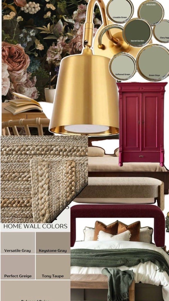
The room has a stunning and ornate pressed ceiling, complete with a brass chandelier with a dimmer switch where one can adjust the brightness. We absolutely love this. The chandelier will simply be cleaned and polished and kept as is. We love the drama of it. The pressed ceiling is to be painted taupe.
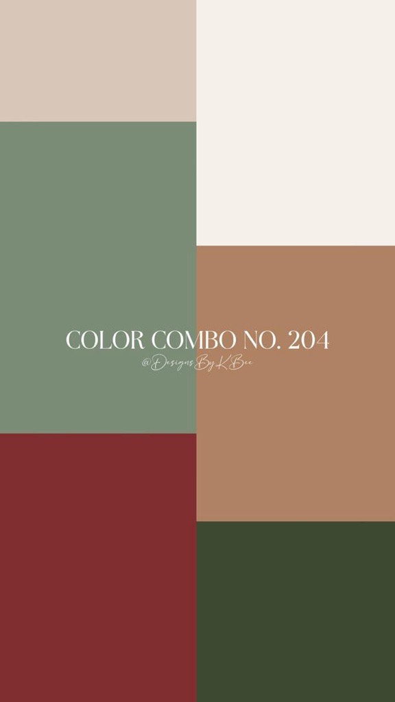
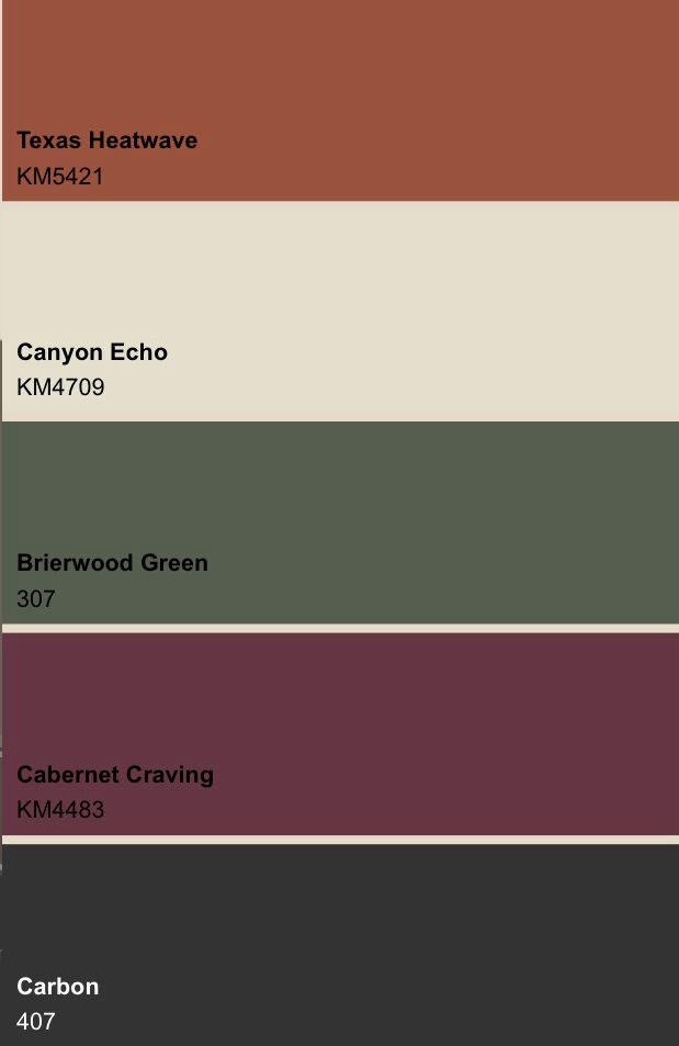
Green is the colour of this season of my life and so it goes without saying that it’s the colour of choice for the principal bedroom. We have chosen a daring green containing a grey undertone.
The skirtings are to be painted caramel. Sounds totally insane especially considering the thickness of the skirtings, but we are confident in this decision.
Gold wall lights/sconces are to be drilled on either side of the bed, above the respective bedside tables.
Lastly, we will complete the bedroom by selecting a baroque-style floral wallpaper to cover one side of the bedroom as a feature-wall. This is the part I am most excited about, and I cannot wait to feel like I have created a hotel-style abode in my very own home.
Burgundy will also make an appearance, though we are not 100% certain where or how. It could take the form of a bench that sits at the foot of the bed, or a reading nook that lies against the bay window that overlooks the garden.
A large neutral woven mat will seal the bedroom - a Persian will be too overpowering amidst the pressed ceilings, brass chandelier, thick taupe skirtings and baroque wallpaper.
I am looking forward to commencing the execution of what I hope will be a dramatic but stunning principal bedroom.
Wish us luck…
Here are this week’s recommendations
Although I am an unapologetic lover of larger homes, I always love seeing how others style their spaces, big and small. This episode of ‘Never Too Small’ really caught my eye and I find the styling of their home beautiful and well considered.
Some ideas for where to take the kids in Joburg over the next several weeks.
Have you picked up the latest issue of House and Leisure magazine yet?
I have just pre-ordered this interiors book by Elle Hervin. I started following her Instagram page months ago. The book arrives in September, and it feels great to already have something to look forward to when spring descends.
I’m keeping a close eye on this Pink Mama’s JHB restaurant page that I stumbled across a few weeks back.
Love
Masa.